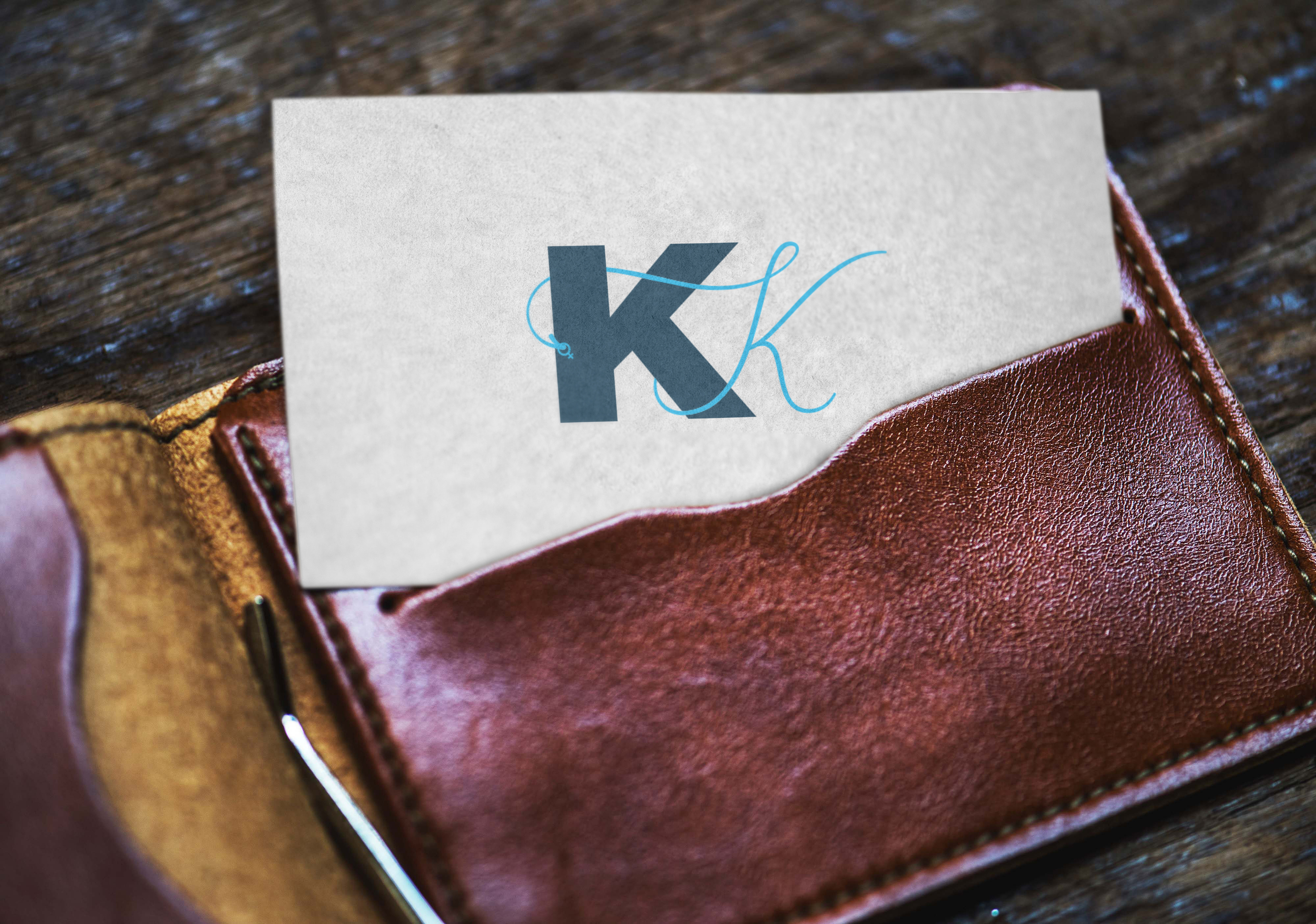
A redesign for the KK logomark for Killing Kittens, a London-based events company which hosts adult parties to sexually liberate women, men and couples.
The brief:
- The logo should consist of two Ks
- The typeface/font style should exude quality, sex appeal and class without appearing too old-fashioned
- Playful elements are encouraged
- The design should be strong but feminine to represent the strength of our independent female members of the community
- 50/50 open-minded men, women and couples that transcend race, gender and beliefs.
My rationale:
The two K’s represent the male and female gender. The K on the left represents the male, the K on the right is the female intertwined around the male. Killing Kittens is about female empowerment; being and feeling sexy. The added embellishment to the end of the female K on the left represents the female symbol.
To empower women on a journey to sexual liberation, exploring their desires and sexuality without fear of judgment, in a safe environment.
Killing Kittens Mission Statement


