

I worked with Therapeutic Kitchen to develop a considered and cohesive brand identity that reflects their holistic, food-first approach to health and wellbeing.
Therapeutic Kitchen offers personalised nutritional therapy, combining science-led insight with achievable lifestyle and dietary changes to support long-term health. The challenge was to create a brand that communicates both credibility and warmth – balancing clinical expertise with an approachable, human tone.
As with all branding projects, the process began with brand positioning –understanding the audience, the competitive landscape, and defining how Therapeutic Kitchen should be perceived.
The goal was to move away from generic “wellness” aesthetics and instead create a brand that feels credible, authentic and knowledgeable – rooted in real food, real life, and sustainable change.
A rich purple was introduced as the core brand colour, chosen to convey integrity, warmth and authority—positioning the brand as both professional and approachable.
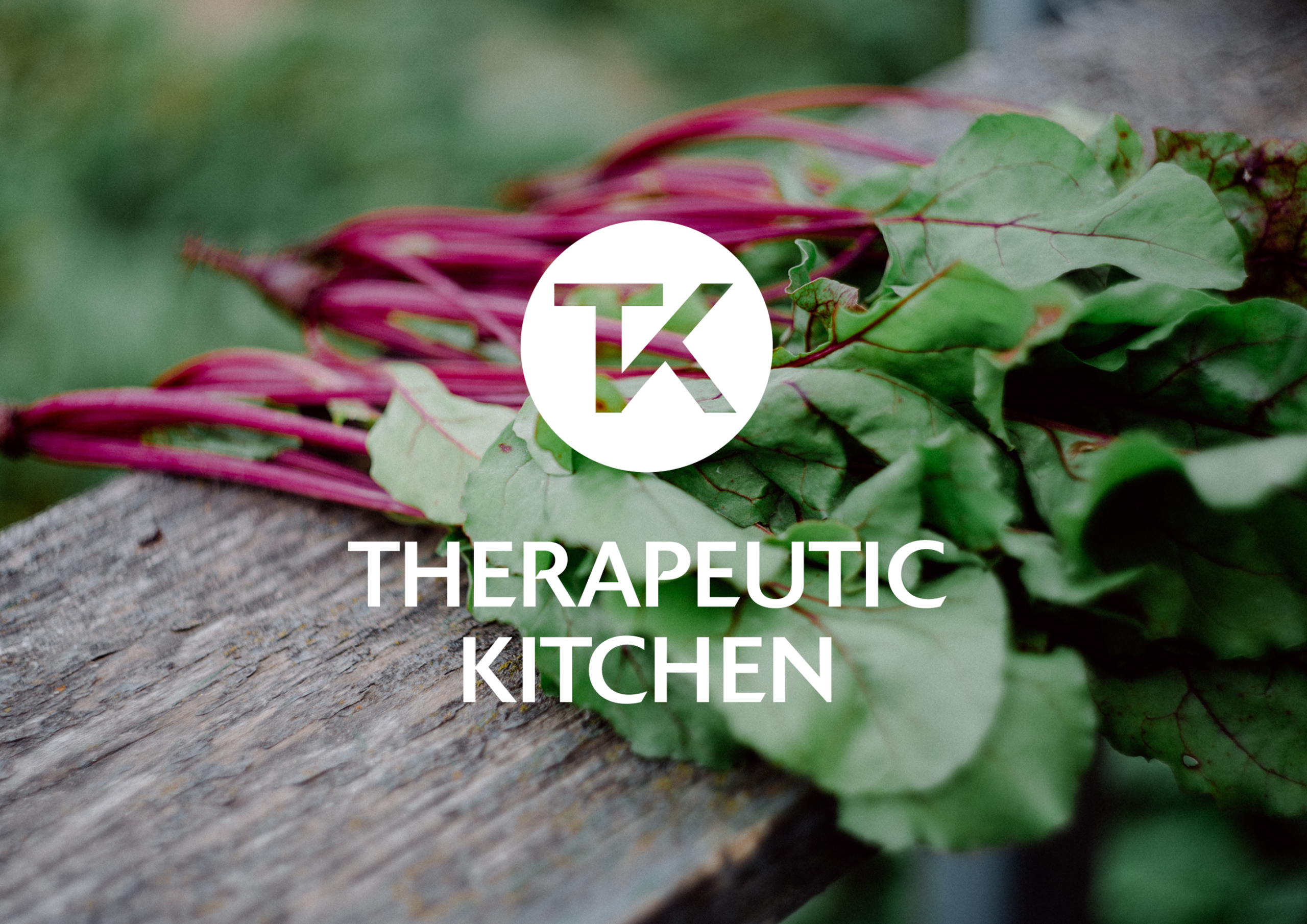
The logo centres around a bespoke icon formed by blending the initials T and K. The font is a distinctive sans serif with strokes that are carved at an angle where they meet vertical strokes. Uppercase creates a sense of authority and confidence, reflecting the brand’s ethos. Designed to work both as part of the full logo and as a standalone brand mark, it provides flexibility across applications while maintaining strong recognition.
The result is a distinctive identity that feels considered, credible and quietly confident within the wellness space.